
Kite Diagrams in Excel
 Kite diagrams can be used to present data. A common usage is to deal with vegetation cover - perhaps on a beach profile.
They can be done using Excel - but it's as tricky as heck! I was asked to try to develop something by someone doing some Advanced Higher Geography work up near Aberdeen in 2013. After several goes at it I actually ended up with something useful.
I'm going to put the sheet up here to show that it can be done as much as anything else. Adapting it might be hideously tricky - I developed the sheets to deal with a set number of vegetation types with a set number of survey points on specific beaches. But, with some persistence, I imagine it might be doable.
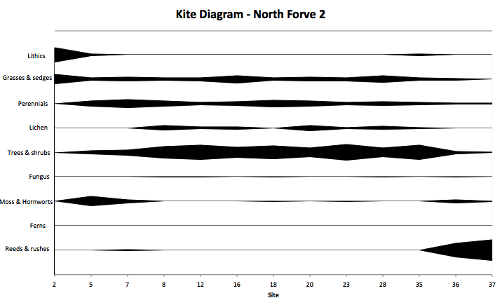
It will produce kite diagrams like this one:
As usual, a diagram like this allows you to add photos and useful annotations in textboxes. That sounds like advanced ICT data presentation to me...
The Resources:
Download and use. Let me know if there are problems with these...
There are instructions on the sheet itself. Note that to do certain things you need to unlock the data entry worksheet. Do this on the Review tab in Excel.
If you have any problems downloading the spreadsheet, let me know and I can send it directly to you.
You might also be interested in the Beach Profile Spreadsheet which is much simpler and easy to use than this one!
Extending the vegetation types:
OK, so I tend to get e-mails asking me if it's possible to add more vegetation types to the diagram.
I'll be honest - it's probably possible but without some serious time I'm not going to be able to do it. But there's a "hack" that will work...
So, say you have 22 vegetation types. The easiest approach to take is to work out the percentages of vegetation types at each point. Then use the sheet to graph just the first 9 vegetation types. Then print the chart.
Then repeat this for the next 9 vegetation types, print it and then repeat again for the last few types. Then, and this is the hack, get an A3 piece of paper, some scissors and some glue and go all old school and cut the charts out and stick them back together to produce a single, large chart.
Note that if you have lots and lots of vegetation types, reducing the size of the charts might be handy. Either use a photocopier or screenshot the charts, save them as image files and then reduce their size somehow.
Note also that I'm old and so remember having to do all this sort of thing by hand when I was in school/college etc... Be grateful you have a spreadsheet to do the hard work for you!
Technical Notes:
The spreadsheet is an Excel 2011 version. It should work in previous versions of Excel without a problem.
There are technical notes on the sheet itself. Note that adding or removing the number of vegetation types might be really quite tricky (changing them is easy!). This is a starting point and I'm not sure that it's ever going to be easy to develop a simple plug and play version of this sheet.
There are various other kite diagram sheets around the internets. None of them seem overly easy to use! I'm happy to think about working on a custom version of the sheet for you if you need it - but you'll need to ask me about that.
If there are any problems at all with getting the sheet working or you want to do something more complex with it but can't figure out how to do that, please contact me and I'll see what I can do.